
Introduction
The economic interests of snack packaging design are unquestionable. With the competitive snack market, a container has developed into a commercial asset or an expensive liability, especially in terms of packaging. The design will cause failure of the product, making a snack invisible on the shelf. It is not a creative blunder, but a measurable loss in R&D and manufacturing investment.
On the other hand, the revenue implications as a result of well-designed packaging are phenomenal and immediate. Ipsos research shows that 72% of American consumers consider packaging as one of the factors in their snack purchasing decisions, and 63% try new products whose packaging caught their attention. This first shelf interaction is critical in triggering the purchase. This guide attempts to address the intricate field of snack packaging design and packaging, the strategies to avoid failures, the fundamental rules that enhance profitability, and the trends defining the field today.
Why Your Packaging Is Your Most Valuable Salesperson
The overall consumer has only seconds to scan a store shelf. Under such a fast, high-stakes setting, shoppers depend on thinking shortcuts in making decisions. Very frequently, the package design is the totality of the sensory information they will incorporate. Studies of consumer behavior have shown that a purchase decision can be made within the shortest time of 0.3 seconds. Your packaging determines whether a purchase will be made or not.
This is the point where shelf psychology kicks in. The packaging design must break through the consumer’s visual scan. This is much easier said than done, as it must push through the noise created by competitors. This requires a good understanding of the distinct visual language of the product category and a decision on whether to conform to or break the visual traditions.
After capturing attention, it is its turn of the package to pass the message of its value proposition immediately. Is this a healthy choice? A premium indulgence? A mobile, easily portable solution? The design should provide answers to these questions tacitly and instantly. It is the tangible representation of your brand values and the initial and possibly the sole guarantee a potential customer will get. Failure here implies that the product, which has been developed, cannot be seen even with its high quality.
Core Principles of Unforgettable Snack Packaging
For a snack packaging design to be effective and impactful, it needs to be built on a strategic foundation. It takes a combination of applied psychology, material science, and visual communication. It is critical to grasp the key principles driving consumer behavior for packaging to be effective.
Mastering Color Psychology for Appetite
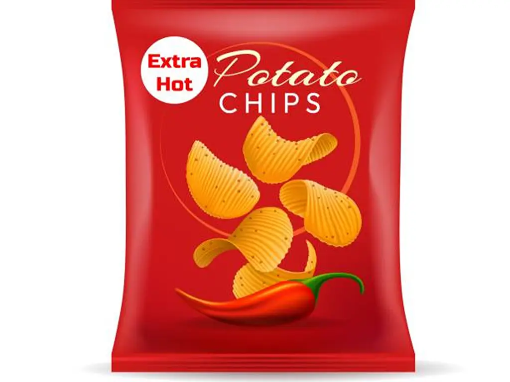
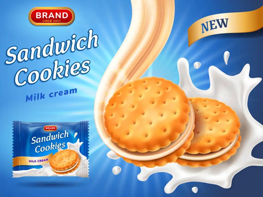
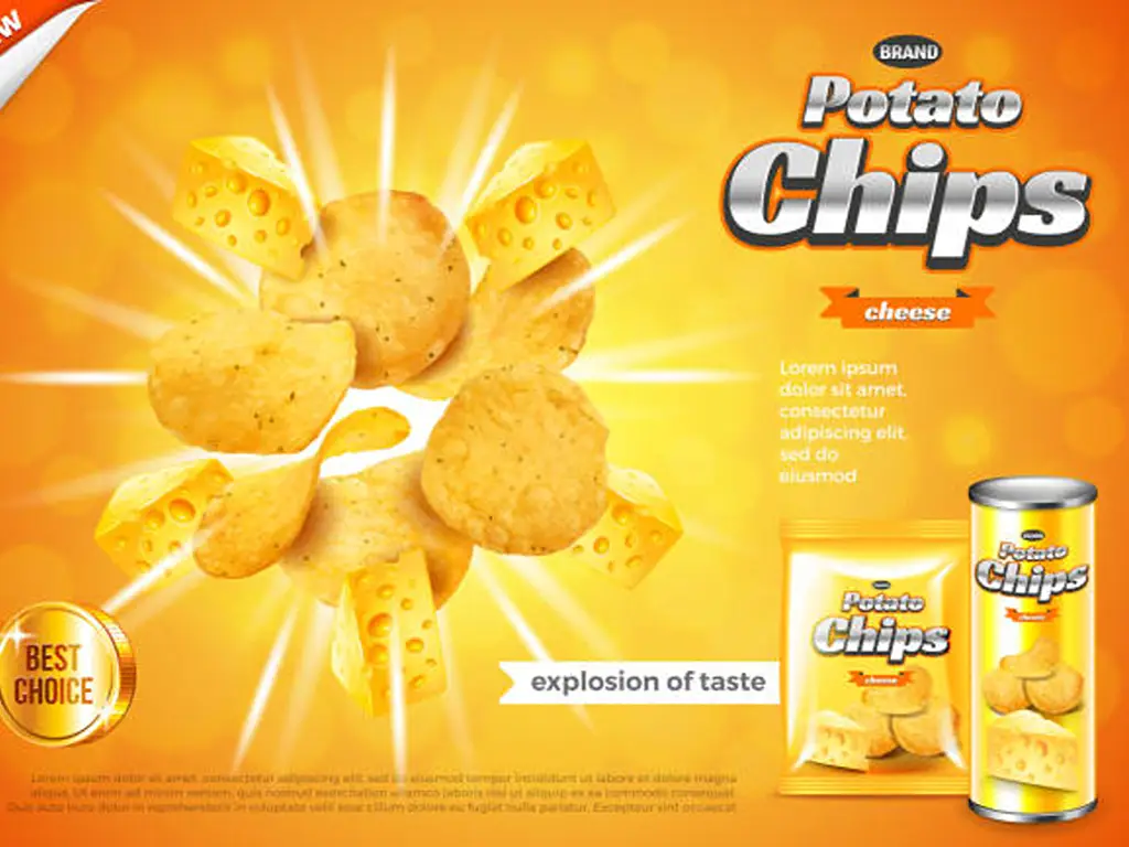
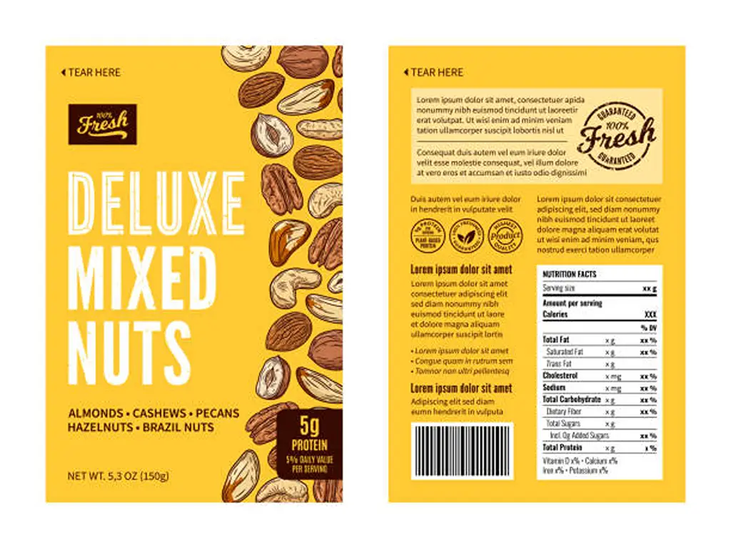
The initial thing that is processed by the brain is color. It is an influential, non-verbal language that can automatically evoke a feeling of taste, quality, and even morality. Mass-market chip and candy brands are also famous for using bright and saturated primary colors (reds, yellows, oranges) to make people feel hungry and energized, and as a way of creating a feeling of fun. On the other hand, the health-oriented snack market is dominated by the use of an earthy palette, including green, brown, and light blue, to suggest the use of natural products, freshness, and reliability. The premium or adult snacks are usually blended with black, dark purple colors, or metallic colors to imply sophistication and a higher price.
Typography That Projects Your Brand Voice
Color may set the mood, but typography gives the message. The chosen font is literally the “voice” of your brand. Does your brand want to be seen as trustworthy and of heritage? A classic serif font may be fitting, and is commonly used for traditional snacks and handmade biscuits. Products are modern, clean, and healthy (vegan or gluten-free)? A clean, minimalist sans-serif font communicates simplicity and clarity. For children’s playful snacks, fun handwritten or bold custom scripts can be used. For small-batch producers, it can be used to signify artisanal. The most crucial part is consistency; the typography on your package should remain faithful to the brand values embedded across your whole marketing.
The Power of Imagery vs. Illustration
How to depict a product is a key consideration in food packaging. High-resolution photography shows potential buyers exactly what they will receive and delivers transparency while showing appetite appeal (which is important for gaining a customer’s trust with new and complicated products). Customers will also appreciate a direct answer to the query “what does it look like?” on the packaging. Custom illustration, on the other hand, is the start of storytelling and the building of the brand’s universe. It can express an abstract emotion, a feeling of roots, or a way of living. Illustrations, along with other techniques, most effectively communicate to niche markets or for products (such as nutrition bars) where the visual form of the snack is far less pleasing than the benefit.
Material & Texture: The Power of Touch
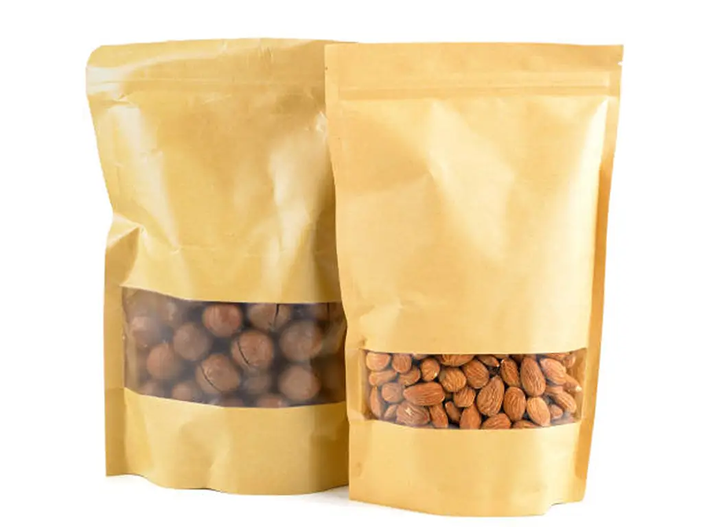
A packaging design is a packaging experience. The haptic quality of a package suggests high quality and reinforces brand positioning. For example, a heavy-gauge paper stock and embossed logo communicate premium quality. Under bright retail lights, a high-gloss finish demands attention. Over the past few years, the health and premium sectors have shifted to matte finishes. A rough, kraft paper texture communicates a rustic, organic, and eco-friendly ethos. The tactile dimension is a subtle but powerful driver of perceived value.
Structural Design: Beyond the Basic Pouch
The physical form of a package is a core part of its identity. While the stand-up pouch has become a dominant and highly effective format, iconic brands are often defined by their unique structures. The Pringles can is a classic example of structural branding—it. It protects the product, creates a unique eating experience, and is 100% recognizable even without a label. Considerations like tear-notches, resealable zippers for portion control, and unique die-cut shapes can all enhance functionality and brand recognition. The structure must be a conscious choice that balances manufacturing cost, durability, and brand identity.
Information Hierarchy: Clarity at a Glance
A package may be beautiful, but in case it is confusing, it will not work. There is a powerful information hierarchy that directs the eye of the shopper in a logical order. In that initial 0.3-second sight, the consumer should be capable of recognizing:
1. Brand: Who makes this? (The logo)
2. Product: What is it? (“Pretzel Thins,” “Keto Bar”)
3. Flavor/Variety: Why this one? (“Sea Salt,” “Spicy Chili”)
4. Key Benefit: What is the main unique selling point? (“Organic,” “20g Protein,” protein content). Any other information, net weight, ingredient lists, brand story, and the rest are secondary, and must be located where they will not interfere with this primary and instant communication.
2025 Inspiration: Top Snack Packaging Design Case Studies
Practice is the best way of understanding theory. Research of the successful designs within a particular market niche can show the way of how these basic principles can be used to address particular problems of business and meet particular needs of consumers.
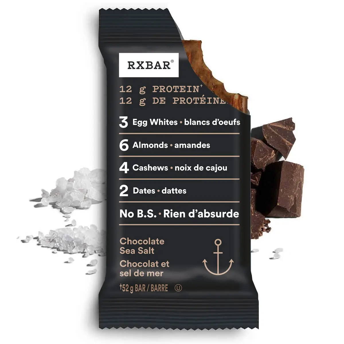
RXBAR: Health & Organic Snacks
RXBAR is a transparency pioneer in design. The brand ethos and the No B.S. are written literally on the packaging. The logo is not printed on the front of the pack; it is an ugly, bold, no-frills list of the main ingredients (e.g., 3 Egg Whites, 4 Almonds, 2 Dates). It is a minimalistic design that defies all the conventional design principles and utilizes the ingredients list as the key brand marker. The color scheme is plain, and it tends to be in the shade of the bar itself, which supports the honesty and transparency message that everything you see is what you get.
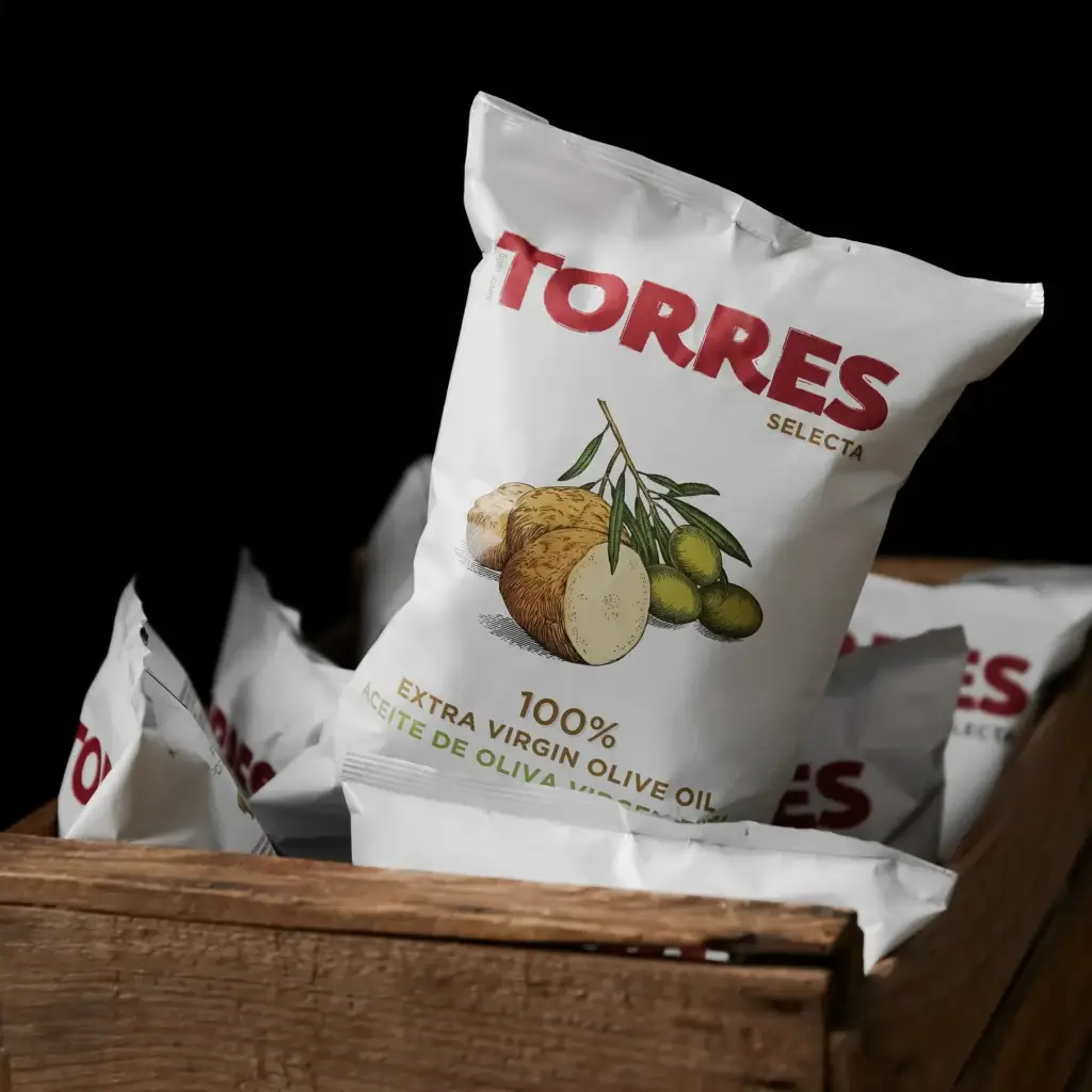
Torres Selecta: Premium & Artisanal Snacks
Torres, the Spanish gourmet chip brand, creatively conveys the reason behind the premium brand price through the chip packaging. Unlike mass market chips, which tend to use bright, garish colors, Torres’ packaging focuses on sophistication. Most of the packaging is simple black or white matte-finish bags, which are tactile and expensive-feeling. The serif fonts are understated, and instead of cartoonish and childish drawings, high-end ingredients (i.e., black truffles, Iberian ham) are used. The whole package does not seem like a snack but more like a part of a fine dining experience, which is a sign of exclusivity and higher quality.
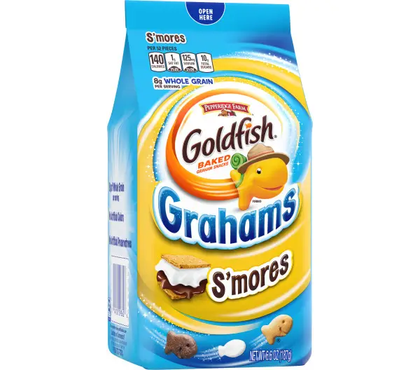
Goldfish: Kids & Character-Driven Snacks
Goldfish crackers by Pepperidge Farm are a great example of snacks that appeal to both kids and their parents. For the child, the packaging is a vibrant, chaotic, and joyful sea of bright primary colors, and the product mascot is a goldfish cracker. The packaging is a mix of primary colors and bright “Cheddar yellow” or “Xtra Cheddar” orange, and the logo font is playful and rounded. For the parent, phrases like “Baked with Real Cheese” and “No Artificial Flavors” are prominent so that they flow with the packaging and help the parent feel good about the snack purchase.
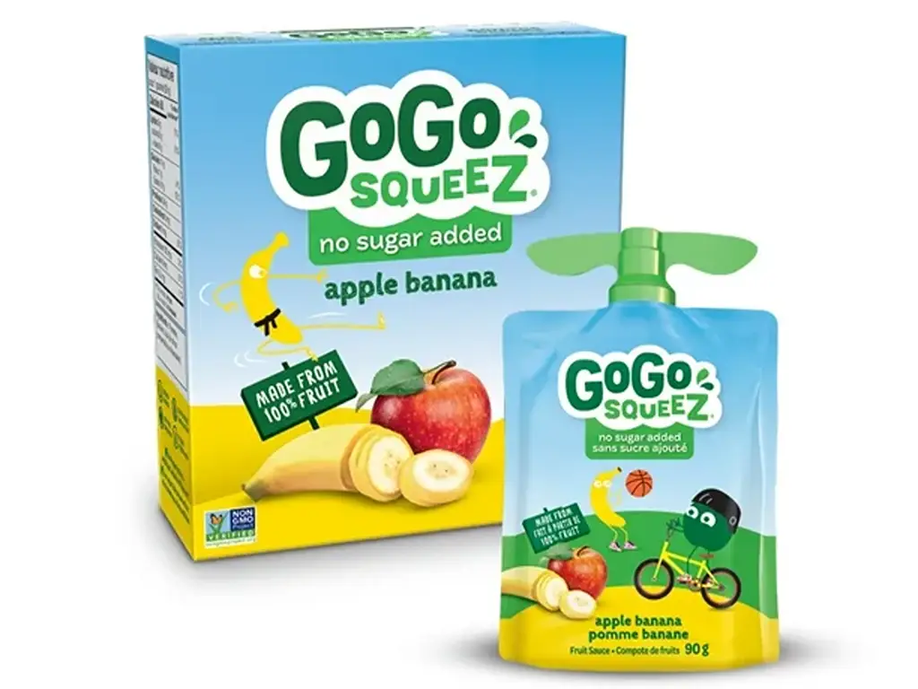
GoGo squeeZ: “On-the-Go” & Convenience Snacks
With GoGo squeeZ, the entire unique selling proposition is structural design. The brand invented the squeezable, re-sealable, portable applesauce pouch, an innovation perfectly designed for convenience for an on-the-go lifestyle. The innovation of the built-in straw and “helicap” design means portion control and no mess for children, and no spoon is required. The graphic design is energetic and simple, and uses bright greens and fruit illustrations to evoke “natural” and “energizing.” The design also communicates the product’s convenience and portability.
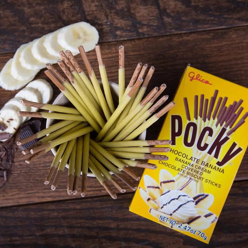
Pocky: Global Flavors & Authenticity Snacks
Pocky is a Japanese brand that has become a global icon, and one of the reasons is its distinct and authentic packaging. The tall, slim, slide-out pack design is distinguishable and sets it apart from ordinary bars and bags. The bold logotype reads “Pocky” in a stylized manner, and the design has a Japanese aesthetic that feels both foreign and approachable. The product photography is of high quality, showing the biscuit sticks, and the design remains the same to serve as a mark of authenticity, assuring the consumer of consistent and genuine Japanese taste.
Baishen Pack: Turning Your Snack Packaging Ideas Into Reality
Having a great packaging design for your snacks needs a great partner. Baishen Pack is chosen for three reasons: speed, total flexibility, and in-house engineering.
In this industry, speed is vital. Thanks to in-house production and the most advanced HP Indigo digital printing, we have the fastest turnarounds, even in the industry, at 7-10 days! This same technology provides true flexibility with low minimum order quantities (MOQs) to help startups and seasonal products for testing. As your business grows, we seamlessly transition to high-volume production using the gravure method.
We have a team of packaging engineers. More than printers, we provide full service at every step, one-on-one, using high-barrier (BRC-certified) materials as well as functionality with zippers, windows, etc. to keep the snacks fresh, while your design is brought to reality, and to ensure commercial viability.
Don’t wait any longer, try us out. For a free stock sample, contact us, and we will provide a digital proof of your envisioned design in 24 hours.
Practical Considerations: Choosing the Right Packaging Format
A great design is wasted if it is put onto the wrong packaging style. Choosing a structure is one of the many strategic decisions one must make that will determine the shelf life and durability of a product, the cost of shipping, and the perception of the brand. All the options have pros and cons, but the format must correspond to the product’s physical requirements, the brand’s target price, and production capacity.
Here is a comparative breakdown of the most common formats:
| Packaging Format | Best For (Brand Perception) | Key Advantages | Key Disadvantages |
| Boxes / Cartons | Classic, traditional, large “billboard” effect. | Excellent structural protection. Stacks well on shelves and in shipping. | Highest cost. Very heavy and fragile (if glass), leading to significant shipping costs (USD) expenses. |
| Rigid Cans / Jars | High-end, premium, luxury. | Ultimate barrier protection (air, light, moisture). Conveys superior quality. | Highest cost. Very heavy and fragile (if glass), leading to significant shipping costs (USD). |
| Flexible Pouches | Modern, convenient, eco-conscious (if lightweight). | Lightweight (lowers shipping costs). Excellent barrier properties. Versatile (zippers, hang-holes). | Less structural protection than rigid options. It can be perceived as less premium than jars. |
| Roll Stock Film | High-volume, mass-market, operational efficiency. | Lowest cost-per-unit for large runs. Integrates directly with FFS machinery for high-speed production. | Requires significant capital investment in FFS machinery. Not a ready-made package. |
In the end, the flexible packaging pouch has been seen to be the most dominant of the modern snack aisle owing to its ability to provide optimal freshness, safety, colorful printing surface, consumer convenience, and shipping efficiency. But to high-volume producers, Roll Stock offers the option of scale directly to the packaging process, making it part of the production.
Future Trends in Snacks Packaging Design
Technological improvements, cultural changes, and shifts in consumer preferences keep changing the snack packaging design. While it’s important to keep track of the current transformations, it’s even more important to understand the reasons for those changes. The future is driven by three predominant forces: the demand for transparency, the quest for a cohesive brand image, and increased digital interactivity.
The Sustainability Imperative: Eco-Friendly Materials
The change in the market is not a marketing gimmick but rather significant and broad. Customers are asking businesses for proof of sustainable practices for environmentally friendly packaging. This is the proof provided to the customers. Claims of sustainability should include proof in the form of tangible solutions. Brands and manufacturers should prioritize their work in the following areas:
Recyclable: Moving on from complicated and blended materials that are difficult to recycle and realigning to mono-materials (like 100% PE pouches) that can be handled by handy recycling systems.
Compostable: Using bio-plastics (like PLA) that are designed to break down under certain conditions at industrial composting facilities.
Recycled Content: Using post-consumer recycled (PCR) materials in new packaging is critical for closing the cycle, as it is for supporting the circular economy. Brands will likely become obsolete in the eyes of the current consumers if they do not embrace a realistic and clear escape from sustainability.
Minimalism, Nostalgia, and Bold Graphics
Brands compete for visual attention in very cluttered spaces, whether in physical stores or on social media platforms. This competition has resulted in three distinctive popular aesthetic approaches. Minimalism, most commonly found in the health industry, applies the “less is more” philosophy, with lots of white space, uncluttered typefaces, and basic graphics to suggest honesty and high-quality ingredients. Nostalgia, on the other hand, aims for emotional comfort. It draws on retro typefaces, vintage colors, and historic design elements to suggest authenticity and a bygone era. Bold Graphics, the third approach, focuses on attention-grabbing elements to respond to the “thumb-stopping” behaviors of digital consumers. It uses aggressive hues, assertive type, and bold designs to demand attention.
Interactive & “Smart” Packaging Futures
Technology is bridging the gap between the static physical package and the dynamic digital world. The most basic example is the QR code, which has transitioned from a simple data-capturing tool to a complex entry point for marketing a product. With a simple scan, consumers can access a plethora of information regarding product sourcing, recipe pairing, and brand contests. More AR interactivity is being added for consumers to “live” the package. Concepts like edible packaging and printed sensors that monitor the freshness of a product no longer exist only in the realms of science fiction.
Conclusion
In snack food packaging, ‘the more the better’ applies to the versatile and competitive market industry. Protective packaging is the brand’s first representative and communicator to the customers. Emotive and instant brand recognition can be achieved with the right combination of psychology, design, and packaging storytelling structure. Successful brands appreciate packaging as a customer brand experience anchor, which cultivates brand trial and loyalty. Due to the evolving trends, innovative brands appreciate packaging as a strategic and creative project. Ultimately, the packaging design is the most prominent communicator to the customers, and it should be authentic, convincing, and primary.