Mylar Bag Design: A Complete Guide from Concept to Print-Ready Artwork
Designing a mylar bag looks simple from the outside: pick a pouch, add a logo, send it to print. The people who have actually done it tell a different story. Between the concept on your screen and the sealed bag on a shelf sit three layers most first-timers never see: die lines, heat-seal zones, and ink behavior on metallized film. This guide walks through all of them, from choosing a style that sells to preparing artwork that prints the way you approved it.
What Makes a Mylar Bag Design Work
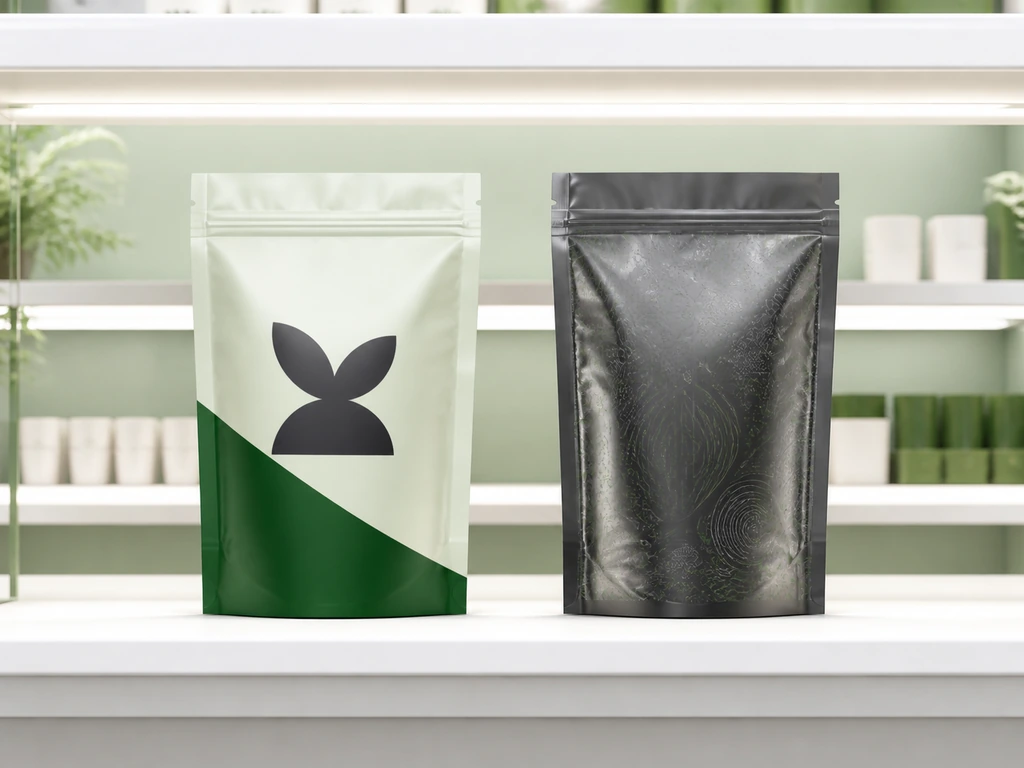
Style is the first decision every mylar bag design has to survive, but it is rarely the most important one. A design works when its product information lands within the three seconds a shopper spends scanning a shelf. At 1.5 meters, small text and dark detail vanish before anything else. Packaging designers call the antidote “blocking”: large, flat color areas that read as shapes before they read as words.
One more thing before choosing a style: the metallic film underneath your artwork behaves like a mirror. It reflects light back through the ink and eats 10–20% of the contrast in dark areas. Pale, high-contrast designs survive metallized film better than moody, detail-heavy ones. That is why so many standout mylar bag designs are built on bright fields and bold typography.
| Style | Visual Character | Best Product Fit | Common Failure |
|---|---|---|---|
| Minimalist | White space, one accent color | Premium coffee, supplements, skincare | Looks empty without a finish to carry it |
| Maximalist | Full-bleed pattern, layered graphics | Candy, snacks, bold retail | Reads as noise below 1.5m unless shapes stay large |
| Retro | 80s/90s palette, vintage type | Coffee, granola, craft snacks | Feels dated fast if the product is new |
| Whimsical | Playful characters, bold shapes | Kids’ snacks, candy, gummies | Mismatches a premium price point |
| Textured | Simulated paper, fabric, emboss effects | Organic lines, tea, spices | Can fight the film’s gloss and look muddy |
Pick the style your category already speaks, then push it one notch. That is how a mylar bag design stands out without confusing shoppers about what is inside.
Finishes That Change How a Design Reads
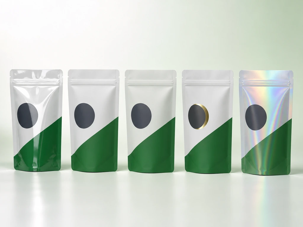
If style is the voice of a mylar bag design, finish is its texture. The same print on gloss film and on matte with a foil accent are two different products. Often the perceived value gap is 10–30%, at a much smaller gap in cost.
| Finish | How It Looks | Cost Tier | What It Costs You |
|---|---|---|---|
| Gloss | Shiny, saturated | Base | Shows fingerprints; highlights wrinkles |
| Matte | Soft, muted, “expensive” | Low | Slightly dulls the metallic sheen |
| Soft-touch | Velvet feel | Medium | Coating weight 3–5 gsm; overuse reads gimmicky |
| Foil stamping | Metallic gold/silver accent | Medium-high | Must stay clear of heat-seal zones. Seal bars run at 130–160°C and lift or wrinkle foil |
| Holographic | Rainbow sheen | High | Comes from an embossed laser film layer, not ink. It fights busy artwork |
Two rules keep finishes from ruining a design. First, dark imagery on metallized film loses depth, because the mirror base reflects through the ink. Second, holographic backgrounds and high-saturation graphics are rivals, not partners: pick one loud element per panel. The difference between “that bag looks premium” and “that bag looks loud” is usually one finish choice, not a new design.
Choosing a Bag Structure That Fits the Product
Structure is where mylar bag design stops being graphic and starts being engineering. The bag’s shape decides how the product stands, opens, and pours. It also redraws the canvas your artwork sits on. Ask two questions in order: how will the product be used, then how will it be displayed.
| Structure | Stands on Shelf? | Best Product Forms | Design Notes |
|---|---|---|---|
| Stand-up pouch | Yes | Coffee, snacks, powders | Bottom gusset carries the weight; keep critical art on the front panel |
| Box-bottom bag | Yes, most stable | Coffee, bulk granola | Four bottom corners are stress points. Fills over 500 g prefer this shape |
| Side-gusset bag | Yes | Tea, seeds, spices | Front panel is 15–20% wider than a flat pouch. Room for denser label copy |
| Flat pouch | No | Powders, single-use samples | Cheapest to produce; design lives on one face only |
| Spout pouch | Yes | Liquids, drinkable supplements | The spout fixes “front” and “back”. The consumer-facing panel sits to the right of the spout when it points up |
| Kraft paper pouch (barrier-lined) | Yes | Organic snacks, tea, coffee | Paper texture sells “natural”; the inner lining does the protecting |
The structure also sets your artboard: a stand-up pouch gives you three panels (front, back, gusset), a flat pouch gives you one. Design for the panel count the structure actually offers, not the one you wish it had.
From Artwork to a Print-Ready File
Here is where most mylar bag designs die. Your design file is not a bag. Between the screen and the sealed pouch sit three doors — the die line, the heat seal, and the ink — and each will modify your design. The only question is whether you modify it first or the factory does it for you.
Dielines, Templates, and Where to Get Them
A dieline is the flat blueprint of a bag: it marks fold lines, seal lines, and the bleed, the three kinds of lines that decide where your artwork may live. In standard practice, bleed runs 3 mm beyond the cut edge, and seal widths run 5–10 mm depending on bag type.
Free downloadable templates (PDF/PSD) are fine for mocking up concepts. But the factory that will make your bags has the authoritative dieline, because it includes the real seal widths, fold compensation, and zipper placement for their equipment. The workflow that avoids rework: confirm bag type and size, request the factory’s dieline as a vector PDF, design on a locked dieline layer, export with the dieline layer intact so the printer can verify it. Keep raster images at 300 dpi or above; logos and text belong in vector format so edges stay sharp through lamination.
Seal Margins, Zipper Clearances, and Other Layout Killers
A designer on Reddit’s graphic design forum put the most common mistake in one line: “A lot of beginners design edge-to-edge, but once the bag is sealed, logos or important info can get cut off.” That failure is the norm for first-time mylar bag designs.
The clearance checklist that prevents it:
- Top and bottom seal bands: keep all text and logos at least 5 mm, better 10 mm, clear of the heat-seal zones. Seal bars press at 130–160°C and crush anything in their path.
- Zipper area: leave 8–10 mm of clear film above a press-to-close zipper. The track bends the film, and print there cracks as the bag opens and closes.
- Tear notches: the laser half-cut sits inside the top seal. Keep 5 mm of clear space around each notch so the cut line stays clean.
- Hang holes: drill at 6–8 mm diameter and at least 6 mm from the bag edge. Smaller holes concentrate stress and tear under hanging weight.
- Windows: a clear window needs a 10 mm printed border around it, or ink will migrate toward the window’s seal edge.
Color on Metallized Film: Why Proofs Look Different
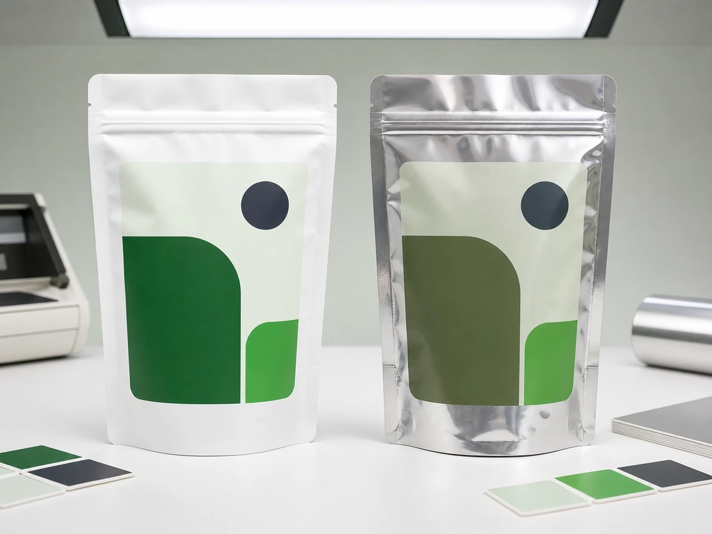
Screens show RGB. Presses lay down CMYK. On top of that, metallized film reflects light back through the ink and shifts everything. The classic complaint is greens that looked fresh on screen and printed as army drab.
Two habits make this manageable. First, expect the shift and proof for it: a digital proof shows layout and typography, but only a physical sample on the actual film shows true color. Printers that match Pantone spot colors on digital presses routinely commit to 95%+ fidelity, measured in ΔE, the industry metric for color difference, where values under 2 are invisible to most eyes (Pantone Matching System, 2026). Second, always request two proofs: one on white substrate and one on the real metallized film. A proof on white tells you nothing about how your dark greens will render on mirror-finish foil. Approving color on the wrong substrate is exactly how “proofs looked perfect, production looked wrong” happens.
Printing Methods and What They Mean for Your Design
Printing method is a design constraint, not a production footnote. It decides how many colors you can afford, how smooth your gradients will be, and whether your idea is producible at your order size at all.
| Method | Setup Cost | Economical Run | Design Freedom |
|---|---|---|---|
| Digital | No plates | 100–10,000 units | Full color, fine gradients, variable data; Pantone matching 95%+ |
| Flexo | Medium (per-color plates) | 10,000–100,000 | Solid colors strong; gradients can band |
| Rotogravure | High (per-color cylinders) | 50,000+ | Highest saturation; fine detail holds over long runs |
| Labels on stock bags | None | Any small run | A fallback, not a finish. Shelf presence is visibly lower than direct print |
Testing a new SKU? Digital printing is the only method where the math works: no plate fees, MOQs in the hundreds, split runs that combine many designs in one batch. For a hero product at stable volume, gravure pays back its cylinder cost in unit price and color punch. And if you already own blank bags, the situation commercial printers on Reddit describe constantly, labeling is the pragmatic path. A labeled bag never looks as finished as a printed one.
For food products, the structure matters legally as much as visually: laminated films intended for food contact fall under FDA 21 CFR 177.1390, which defines the laminate structures that may safely touch food at temperatures up to 135°C (eCFR — 21 CFR 177.1390, 2026). Ask your supplier which regulation their film structure is built to. A supplier that cannot answer in one sentence has not done the homework you are paying for.
MOQ, Proofs, and the Timeline from Design to Delivery
A realistic timeline looks like this, with healthy time windows at each step:
On minimums: digital printing has brought the entry point down to roughly 100 units. That is what makes mylar bag design a viable experiment for a startup instead of a warehouse gamble. Gravure makes sense from around 50,000 units. In between, split runs, many small SKUs combined into one print batch, let e-commerce sellers launch a 30-SKU line without paying 30 sets of plate fees.
Respect the proof stage for one reason: it is the only point in the process where changing your design costs nothing. After artwork approval, every change is a new bill.
How to Vet a Custom Mylar Bag Supplier
A Quora question sums up the mood of every first-time buyer: “How do you verify whether a custom packaging company is legitimate before placing a large order?” A brand owner on Reddit’s entrepreneur forum put it more plainly: “packaging has been the most frustrating part so far.” If supplier selection feels like the riskiest step of mylar bag design, you are not alone.
What to Check Before You Pay
- Free samples first: get a stock sample in hand before paying anything. Feel the film, test the zipper, inspect a printed sample. A supplier confident in its materials sends samples without friction.
- Certifications you can look up: ISO 9001, BRC, and SGS test reports all carry document numbers. Ask for the numbers, not the logos.
- A technical answer, not just a price: ask what film structure the bag will use, layers, thicknesses, functions. A quote that cannot name the structure is a quote you cannot audit.
- Proof commitments with a deadline: “24–48 hours for digital proofs” is a concrete, checkable promise; “we’ll send it soon” is not.
- Written delivery milestones: production time and shipping time stated separately, with a dispatch confirmation at the end.
Red Flags That Show Up in the Proof Stage
- The same low-level mistake appears in consecutive proofs. That signals no internal QC pass between you and the press.
- Color differences get explained away as “that’s just printing.” A competent printer gives you a ΔE number instead of a shrug.
- Proofs keep arriving on white substrate when your bags are metallized. Approving color on the wrong film is how production surprises happen.
- Nobody on the supplier side has flagged a seal-margin or zipper-clearance problem in your artwork. An experienced partner catches layout conflicts before you pay for them; silence at the proof stage means you are the quality department.
At Baishen Pack, we use the proof stage to make the bag better, not simply to approve a file. Our digital-print team can quickly turn your artwork into a proof, while our packaging engineers check the film structure, seal margins, zipper clearance, color, and finish against the bag’s production requirements. With no printing plates to remake, we can refine designs, divide a run across multiple SKUs, and support low-volume launches without locking you into a large first order. See how we approach quality and customization, or send us your artwork for a practical review.
What Mylar Bag Design Actually Means for the Business
Step back from the layout checklist and a pattern appears: the frustrations buyers report are never about the artwork itself. The brand founder says packaging was the most frustrating part of launching a snack brand. The designer discovers too late that edge-to-edge art gets cut off at the seal. The buyer praises a supplier for colors that “matched our artwork surprisingly well” while quietly counting the days lost to “a short delay during the artwork confirmation stage.” Every one of these complaints is about the pipeline between artwork and finished bag, not the design.
That pipeline is where the market’s real preferences show. Buyers reorder from suppliers whose proofs are fast and whose color holds: speed and fidelity rank above unit price in repeat purchasing. Disappointment concentrates in one stage, proof approval, because it is the only stage where the buyer can see errors before paying for them. And the knowledge gap is structural: most small brands buy packaging once or twice a year, so they never accumulate enough experience to tell a good supplier from a lucky one. That is exactly why the checklist above exists.
The same facts read differently from the supply side. Custom bag orders split into two business shapes. Test and launch orders are project business: a few hundred units, digital printing, no plates, decisions made in days. Buyers are founders and e-commerce sellers betting their launch budget on a supplier they cannot fully verify. Replenishment orders are inventory business: tens of thousands of units on gravure cylinders, where batch-to-batch color consistency and on-time delivery matter more than the invoice. A supplier serving both must be two companies at once, flexible enough for a 100-unit experiment, stable enough for a 50,000-unit commitment. The low-MOQ capability that lets a startup test a SKU and the process discipline that keeps a long run color-consistent rarely live under the same roof. When they do, that supplier’s proof-speed promises and QC stages become the buyer’s risk insurance.
Do you now have a clearer picture of what makes a Mylar bag design print-ready? If you have a packaging idea—or artwork that needs checking—talk to us at Baishen Pack. We will help you move from concept to a production-ready bag.
References
- eCFR (Electronic Code of Federal Regulations). “21 CFR 177.1390 — Laminate structures for use at temperatures not exceeding 135 °C.” 2026.
- Pantone. “Pantone Color Systems — The Universal Language of Color.” 2026.
- Baishen Pack. “About — Factory certifications and quality control.”
- Baishen Pack. “Contact — Service and turnaround commitments.”
- Baishen Pack. “Custom Mylar Bags — Specifications and capabilities.”
- Baishen Pack. “Case Study.”
- Baishen Pack. Homepage.