
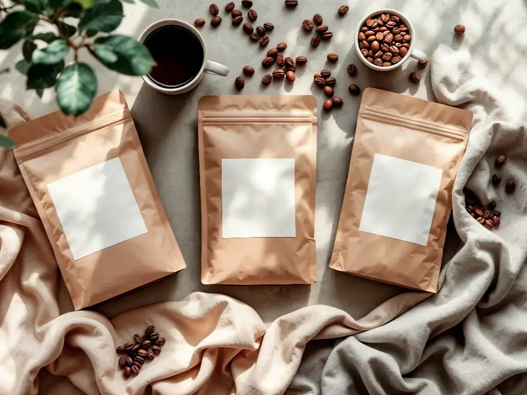
In the case of coffee roasters and brand owners, the main point of contact with the consumer is the packaging. It is the dumb salesman on the shelf, a powerful tool for engagement, and the feel in the hand of the customer. Effective coffee packaging is essential in a competitive market. Nevertheless, there is often a great disconnect between the design ideas that are developed on a computer screen and the physical reality of the flexible product packaging production.
A design that looks perfect in a digital mockup may fail in the manufacturing process because of material properties, printing constraints or functional constraints. Colors change, text is interrupted by lines of seals, and finishes do not act as they should.
This manual fills the gap between creative aspiration and manufacturing engineering. It offers a technical roadmap on how to translate brand vision into a viable and high-quality physical product so that the end product is similar to the original intent, creating a lasting impression.
The Gap Between Digital Art and Printed Coffee Bags
The conversion of a digital file to a physical coffee bag entails a paradigm change in physics. Light (RGB: Red, Green, Blue) is used to create colors on a monitor. In printing, ink (CMYK: Cyan, Magenta, Yellow, Key/Black) is used to produce colors.
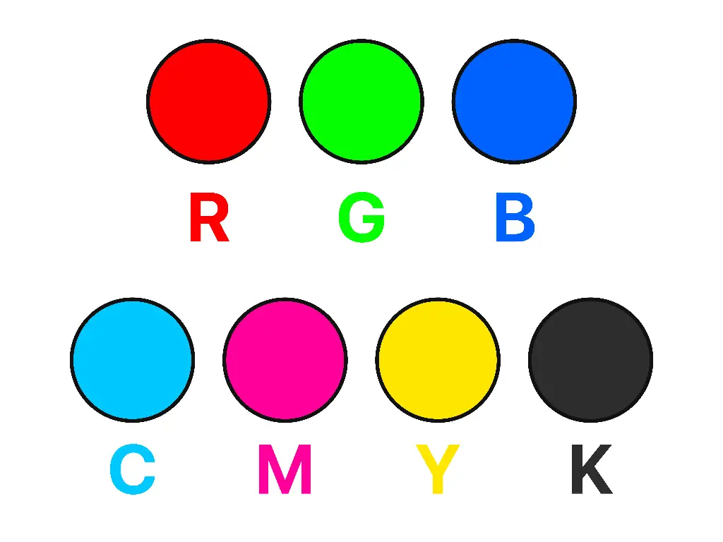
This is not just a technical environment in Adobe Illustrator, but it is a limitation of chemistry. RGB is able to show millions of neon, vibrant colors that cannot be shown by standard ink. When a designer is working in RGB and then at the last moment, he/she is converting to CMYK, the bag that is printed will appear dull and muddy as opposed to the screen.
Moreover, a digital canvas is flat and immobile. A coffee bag is a flexible, three-dimensional, and dynamic bag. It is heat-sealed, folded, and filled. The nuances of coffee bag design introduce physical variables that a 2D artboard does not take into account, and are introduced in the manufacturing process:
- Substrate interference: The ink color depends on the color of the bag material.
- Mechanical variance: The machine which shapes the bag is subject to a tolerance of movement (usually +/- 2mm). Perfectly aligned designs tend to fail.
- Heat distortion: The sealing jaws use a lot of heat to seal the bag. When ink is put in the seal area, it may smear or fail to seal the bag correctly resulting in stale coffee.
The first step towards successful coffee packaging design is to understand these physical realities. Creative packaging should be done keeping the manufacturing end-state in mind.
Selecting the Right Pouch Style for Your Design
The pouch style is canvas. It determines the area of printable surface, the shelf stability of the bag, and the interaction of the consumer with the product. Using the same artwork on other packaging options without modifying it will lead to poor branding and user experience.
Stand-Up Pouches vs. Flat Bottom Pouches
Stand-Up Pouch (Doypack) is the most efficient and cost-effective in the coffee industry. It has a closed bottom gusset that swells up when stuffed.
- Design Implication: The front of a stand-up pouch is curved. The front panel curves out when it is stuffed with coffee beans. Large images or text may be distorted by this curvature when they are too near the edges. When the bag is on store shelves, the bottom gusset is usually not visible, so any important information must not be put in the lower 15% of the bag unless the target audience is supposed to see it when they hold the product.
The Flat Bottom Pouch (Box Pouch) can have a completely flat front panel, side gussets, and a flat bottom.
- Design Implication: This structure resembles a box of hard material. The front panel is relatively flat even when filled, and provides a premium billboard effect. It offers five different printable surfaces (Front, Back, Bottom, Left Side, Right Side). This enables the information to be segmented better, branding on the front, brewing guides on the back, and origin stories on the side, satisfying consumer expectations.
Why Side Gusset Bags Need Special Layout Attention
Side Gusset Bags are conventional and space-saving, yet have certain layout issues. The front and back panels are joined together in this format by side folds.
The most critical design issue in this case is the K-Seal or bottom seal area. The bottom folds form a triangle space where the side gusset folds. When a designer puts text or a barcode in this lower corner, it will be folded and disappear as soon as the bag is made.
Moreover, the side gussets provide a thin vertical strip for design. It is a great place to have high contrast and bold colors (such as the name of the roaster), but not a great place to have paragraphs or complicated images. The substance in this case crunches and bends a lot in the process of handling and this may render small text hard to read.
How Material Choice Impacts Visual Design
Flexible packaging does not print the ink on the bag, but rather on a layer of film, which is then laminated to other layers. The color and resolution of the print are altered by the optical characteristics of the outer layer and packaging materials, which affect the perception of the human eye.
Kraft Paper: Handling Ink Absorption and Colors
Kraft paper has a natural, organic look, which suggests sustainability and craft. It is, however, the hardest to print on effectively.
Paper is absorbent and porous. Ink applied on raw Kraft paper is absorbed by the fibers. This results in two issues:
- Dot Gain: The ink is dispersed, and the fine lines become blurred and the images become blurred.
- Color Muting: The paper is brown and the ink is translucent. A yellow printed on brown paper will be seen as a muddy ochre.
In order to produce vivid colors on Kraft, a White Ink (underprint) layer is necessary. The printer initially prints a silhouette of white ink in the precise form of the bag design, and then prints the CMYK colors over the white layer. This gives it a neutral base that does not allow the brown paper to change the color values. A special layer in the art file is required by designers to store the white ink plate.
Matte vs. Gloss vs. Soft-Touch Finishes
The finish is not merely a texture, but a filter, which changes contrast.
- Gloss Varnish: Reflects light. It enhances saturation and contrast, making blacks appear darker and colors appear brighter. It is best suited to design elements that require high impact.
- Matte Varnish: Diffuses light. It flattens the image, decreasing contrast. It gives it a high-tech, contemporary appearance, but can cause dark colors to look a little faded (e.g., a deep black can look charcoal).
- Soft-Touch Matte: This is a special tactile finish that is similar to velvet or peach skin. Although it has a high-quality hand-feel, it has a tendency to dull colors even further than regular matte.
A common technique in high-end, unique coffee packaging is a “Spot UV” or “Spot Gloss” technique. The whole bag is matte, although the logo or certain patterns are glossed with a varnish. This provides a visual and tactile contrast which attracts the eye to the brand element.
Printing Techniques: Digital vs. Rotogravure
The decision on the printing method is a business decision that is a balance between cost, volume, and time. It is also a technical choice because various approaches possess varying abilities in terms of color range and resolution.
The conventional mass production technique is Rotogravure Printing. It is the process of engraving images on copper-plated steel cylinders, each cylinder being a different color (CMYK + Pantones).
- The Constraint: This process involves a lot of initial investment in the cylinders (plates) and Minimum Order Quantities (MOQs), which are usually 10,000 or more units.
- The Advantage: It provides uniform quality in long runs and can be matched with particular Pantone colors, including metallic inks. The lead time is, however, long (20-25 days) and a design change would require new cylinders to be manufactured.
Digital printing has transformed the coffee packaging environment, especially for small to medium coffee brands. Digital technology eliminates the need to engrave physical plates in every color as opposed to the traditional methods, which demand that the plates be engraved beforehand. This removes the high setup costs and lead times of rotogravure. It allows split-run printing, in which multiple SKU designs, e.g., various single-origin roasts, can be printed in a continuous run without pausing the press. Digital offers a high-quality, agile alternative to mass production for brands that need speed-to-market and flexibility in inventory.
At Baishen Pack, we leverage HP Indigo 20000 and 25000 digital presses to bridge the gap between quality and flexibility. This technology allows us to offer custom packaging advantages that align with modern retail demands for coffee products:
- Low MOQ: We can produce orders as small as 500 pieces. This allows roasters to launch seasonal blends or limited editions without committing to thousands of unused bags.
- Color Accuracy: The HP Indigo system covers 97% of the Pantone color gamut. While it uses a variation of CMYK (CMYKOV), it achieves richness and density comparable to rotogravure.
- Multi-SKU Printing (Split-Run): Digital printing allows different designs to be printed consecutively without stopping the press. A client can order 5,000 bags total, split across 5 different coffee origins (1,000 of each), all in the same run. This flexibility is impossible with traditional plate printing.
For any coffee business scaling up, Baishen Pack functions as a comprehensive partner. We utilize digital printing for market testing and small batches, and seamlessly transition clients to Rotogravure or Flexographic printing when their volumes justify the switch to mass production.
Strategic Placement of Valves, Zippers, and Text
Functional elements are not intangible. They are tangible items that take up space on the bag. One of the most frequent mistakes in coffee bag design is the location of important aesthetic features in the places where functional elements have to be located.
- The Degassing Valve
The single-way degassing valve is a key to coffee freshness. It is a plastic disc that is hard and welded into the film to release carbon dioxide emitted by the beans after roasting.
- The Error: Having a logo or a face directly over the position of the valve.
- The Consequence: The image will be distorted by the heat seal on the valve. The valve itself forms a bump that destroys the continuity of the visual.
- The Fix: Do not leave any important graphics in the valve area. The valve is usually positioned on the front (upper center) or the back (upper third).
- The Zipper and Tear Notch
The zipper is resealable, and the tear notch is easily opened.
- The Error: Placing the tagline or flavor profile notes too high on the bag.
- The Consequence: As the customer rips the top to open the coffee, he/she rips the text. The branding is ruined when it is used for the first time.
- The Fix: Have a minimum of 30mm-40mm between the top of the bag and the Safety Zone. Make sure that the design predicts the point of the bag being ripped.
- Sealing Margins
A bag has side seals that are about 5mm-8mm wide.
- The Error: Running text right to the edge of the layout.
- The Consequence: The text gets caught in the seal, becoming illegible and potentially compromising the hermetic seal of the bag, which affects the shelf life.
- The Fix: Leave a minimum distance of 10mm between text and barcodes and any edge or fold line.
Mandatory Labeling Requirements for Compliant Coffee Packaging
In addition to aesthetics, coffee packaging is a legal document. It should be sold in accordance with the rules. Although regulations differ depending on the region, it is best practice to comply with the FDA (USA) and overall international standards to be credible and manage liability. Clear labeling is one of the most important considerations.
The absence of these aspects may lead to retail recalls or penalties.
- Statement of Identity: The word “COFFEE” (or “Whole Bean Coffee,” “Ground Coffee”) should be displayed prominently on the Principal Display Panel (PDP). It has to be parallel to the package base.
- Net Weight: This should be located in the lower 30 percent of the front panel. It should be in a large font and should be differentiated from other text. It involves Imperial (oz) and Metric (g) units (e.g., 12 oz (340 g)).
- Manufacturer/Distributor Info: Name and address of the manufacturer, packer, or distributor should be provided. This is normally located at the back or side panel. It is enough to say “Distributed by [Brand Name]” when you are using a contract roaster.
- Roast Date: It is not a legal requirement that is related to safety, but it is a quality standard in the industry. Create a special blank area or box in which the roast date can be stamped or printed in the production process to indicate the type of coffee.
- Origin Disclosure: If you claim a specific origin (e.g., “100% Colombian”), the contents must verify that claim. The coffee label design must incorporate this product information clearly.
Designing for Sustainability: Recyclable and Compostable Realities
The concept of sustainability is a significant force in the contemporary coffee market, yet the sustainable packaging materials do not act like the traditional laminates. Sustainable coffee packaging places certain physical limitations on the design process and the manufacturing workflow. These limitations can be learned in advance to avoid expensive redesigns and minimize environmental impact.
The key distinctions between the two main sustainable materials are presented in the table below:
| Feature | Recyclable (Mono-material PE) | Compostable (PLA/NK) |
| Material Composition | Made entirely of Low-Density Polyethylene (LDPE). | Made from plant-based biodegradable materials like corn starch or wood pulp. |
| Heat Resistance | Low. The material stretches easily under heat. | Sensitive. Can deform if sealing temperatures are too high. |
| Design Registration | Strict Limits. Avoid tight trap lines or complex patterns requiring microscopic alignment due to material stretch. | Moderate. Registration is generally stable, but material handling is delicate. |
| Surface Finish | Naturally Matte/Hazy. High-gloss finishes are difficult to achieve without adding non-recyclable coatings. | Matte/Paper-like. Often has a natural, organic feel. |
| Ink Restrictions | Standard inks work, but surface treatment is required for adhesion. | No Metallic Inks. Metal particles are not compostable. Colors may appear less vibrant. |
| Barrier & Shelf Life | Good. Offers decent moisture and oxygen protection, though slightly less than aluminum foil. | Short to Medium. Barrier properties degrade over time. Best for high-turnover products. |
Pre-Press Checklist: Preparing Files for the Manufacturer
The last stage of the design process is the technical handoff. Sending a messy file to the manufacturer will slow down production and the chances of making mistakes.
The engineering department of Baishen Pack checks the printability of each file, yet a clean file will be quicker to transfer to the press. Paying attention to key details is crucial.
Here is the Essential Technical Checklist:
- File Format: Adobe Illustrator (.AI) or PDF is the standard. Never send Photoshop (.PSD) files for text or logos, as they will pixelate.
- Color Mode: Convert all files to CMYK. Remove any RGB elements. If you require specific brand colors, assign them as Pantone (PMS) swatches within the file.
- Fonts: “Create Outlines” for all text. This turns the text into vector shapes. If you do not do this, and the printer does not have your specific font installed, the computer will replace it with a default font, ruining the design.
- Images: Ensure all embedded raster images (photos) are at least 300 PPI (Pixels Per Inch) at full size. Low-resolution images will look blurry on the final bag.
- Layers: Organize the file. Keep the Dieline (the template lines) on a separate, locked layer. Put the artwork on a separate layer. Put the White Ink on a separate layer.
- Bleed: Extend the background artwork 3mm-5mm beyond the cut line. This ensures that if the cutting knife is slightly off, there is no white hairline at the edge of the bag.
Conclusion
It is not only creativity that is involved in the process of transforming a digital idea into a tangible item on a store shelf; it also takes engineering accuracy. A gorgeous design that does not work on the packaging line is not an asset but a liability.
In order to make sure that your best coffee packaging serves not only to keep your beans safe but also to advertise your brand identity and brand story, you must close the gap between the artboard and the factory floor. With knowledge of material behaviors, consumer behavior, awareness of print constraints, and compliance requirements, you can produce packaging that is aesthetically beautiful and commercially feasible, and creates an emotional connection with the coffee shop customer.
At Baishen Pack, we do not just print bags; we act as your technical consultants. From checking your files for printability to selecting the right material structure for your specific roast, our team is dedicated to eliminating production surprises.