Chip Bag Design: A Complete Guide from Materials to Production
What Chip Bags Are Made Of — The Multi-Layer Foundation
Most people think a chip bag is just a plastic wrapper. In reality, it’s a precision-engineered multi-layer structure — each layer serving a distinct function that no single material can deliver alone.
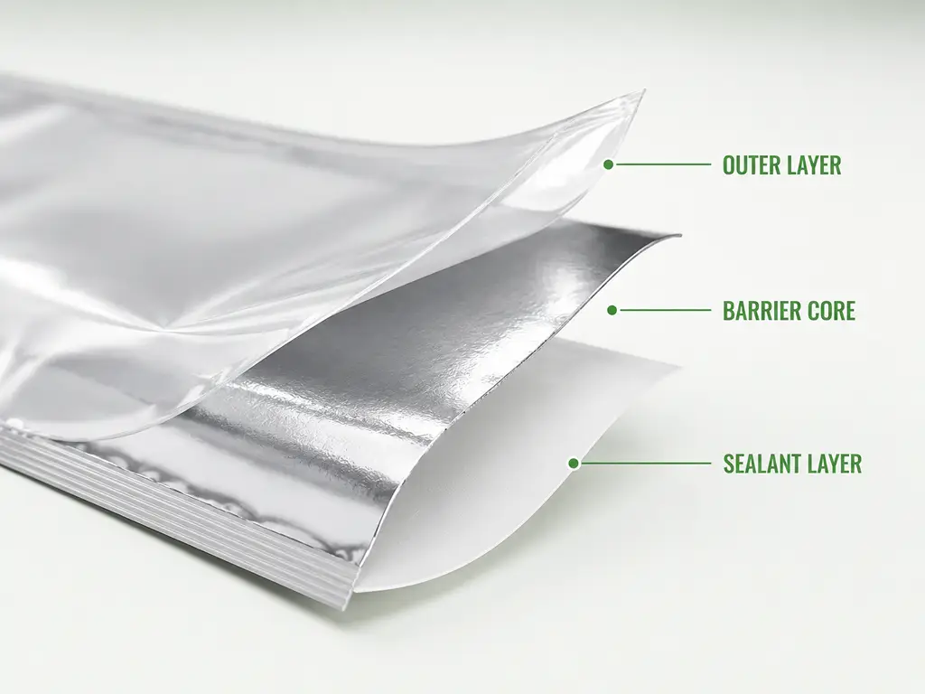
At minimum, a chip bag consists of three functional layers. The outer layer — typically PET (polyester) or BOPP (biaxially oriented polypropylene) — provides the printing surface and puncture resistance. This is the layer that carries your brand design, and it needs to be tough enough to survive distribution without scuffing or tearing.
The middle layer is the barrier workhorse. For conventional chip bags, this is either a thin aluminum foil (6–9 microns) or a metallized PET film (VMPET) with an optical density of 2.5 or higher. This layer blocks two things that destroy chip freshness: oxygen and moisture. The technical targets are unforgiving — oxygen transmission rate (OTR) must stay below 1 cc/m²/day, and water vapor transmission rate (WVTR) below 0.5 g/m²/day. Above these thresholds, chips go stale before they reach the consumer.
The inner layer — food-grade PE (polyethylene) or CPP (cast polypropylene) — is the sealant. It creates the airtight heat seal that locks in freshness and the nitrogen flush that cushions chips against breakage during transport.
| Layer | Function | Common Materials |
|---|---|---|
| Outer (Print Layer) | Print surface, puncture resistance | PET, BOPP |
| Middle (Barrier Layer) | Oxygen & moisture barrier, light blocking | Aluminum foil (6–9 μm), Metallized PET (VMPET) |
| Inner (Sealant Layer) | Food-safe heat seal, leak-proof closure | PE (Polyethylene), CPP |
Think of it like a sandwich: the bread protects the outside, the foil wrap blocks air and light, and the inner wrap seals everything tight. The chip bag works the same way — just with materials engineered at the polymer level rather than kitchen supplies.
Chip Bag Formats — Which Shape Fits Your Product
Material choice protects your chips. Bag format sells them. The shape of your package determines how it sits on a shelf, how consumers interact with it, and which retail channels it works for.
| Format | Description | Best For | Shelf Advantage |
|---|---|---|---|
| Pillow Pouch | Classic fin-seal, cost-effective, high-speed filling | Single-serve, vending, convenience stores | Lowest per-unit cost, compact |
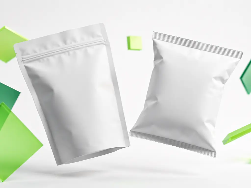
| Stand-Up Pouch (SUP) | Gusseted bottom, self-standing, often resealable | Premium retail, multi-serve, grab-and-go | Superior shelf presence, 360° branding surface |
| Flat-Bottom Pouch | Rigid box-like base, maximum printable area | Family/party size, club stores, bulk | Most stable display, largest front panel |
| Gusseted Side-Seal | Expandable sides, high fill volume | Bulk foodservice, irregular chip shapes | Maximum capacity, crush protection |
Behind each of these formats are precise engineering tolerances. A stand-up pouch bottom gusset needs to be 20–25% of the bag width — too shallow and the bag tips over on shelf, too deep and you’re wasting material. A pillow pouch fin seal must be 8–12 mm wide; below 8 mm, the seal risks bursting during transport. And every chip bag, regardless of format, must reserve 20–30% of its total internal volume as headspace — the empty upper portion that cushions chips and holds the nitrogen flush that prevents oxidation.
The format choice ultimately follows the sales channel. Vending machines and convenience store hanging strips favor pillow pouches. Supermarket shelves reward stand-up pouches. Club store pallet displays demand flat-bottom stability. Your channel picks your format — and your format becomes the canvas for everything that follows.
Visual Design Principles for Chip Bags That Sell
Effective chip bag design operates on a brutally simple rule: the consumer makes a purchase decision in under three seconds. In that window, your bag must communicate three things — what the product is, what flavor it is, and why it’s worth picking up instead of the one next to it. Every design element that follows serves this three-second rule. If it doesn’t, it’s decoration, not design.
Color Psychology and Typography Strategy
Color and typography are the first things the brain processes — before any words are read, an emotional response to color and shape has already formed.
In the snack aisle, color follows predictable psychological patterns. Warm tones — reds, oranges, yellows — trigger appetite and impulse. This is why the chip aisle glows warm. Green signals natural, organic, or health-oriented positioning, and works especially well for veggie chips, baked varieties, and better-for-you sub-brands. Blue is rare in salty snacks, which makes it a powerful differentiator — it reads as premium, cool, and distinct from the warm-toned competition. Black signals ultra-premium or artisanal positioning.
The non-negotiable rule is contrast. Your brand name and flavor name must survive the “squint test” — if you squint at the design from arm’s length, can you still identify the brand? If not, the hierarchy is wrong.
Typography follows the same clarity-first logic. Sans-serif fonts with substantial weight dominate successful snack packaging — they are readable at shelf distance and project confidence. Serif fonts, by contrast, read as formal and slow, rarely appropriate for an impulse category. Custom hand-lettered logotypes can telegraph craft and authenticity for smaller artisanal brands, but they must remain legible at small sizes.
One practical benchmark: the flavor name should be at least 60% of the brand name’s font size. Below that ratio, shoppers cannot distinguish flavors from shelf distance, and they default to the familiar brand rather than yours.
Imagery, Flavor Hierarchy, and Visual Architecture
Here’s the challenge unique to chips: the product itself looks similar across brands. A tortilla chip is a tortilla chip. So the packaging image must do the heavy lifting of creating differentiation and appetite appeal.
Two schools of thought dominate. Food photography — a high-resolution, styled shot of the actual product — drives appetite directly. When the consumer sees a perfect, golden-crisp chip with visible seasoning, the craving is immediate. This is the route taken by most mainstream brands. Illustration and character IP — mascots, hand-drawn ingredients, or stylized flavor worlds — build emotional connection and brand personality rather than direct appetite. Think of the difference between Lay’s (product-forward) and a craft brand with watercolor pepper illustrations (story-forward). Both work, but for different consumer mindsets.
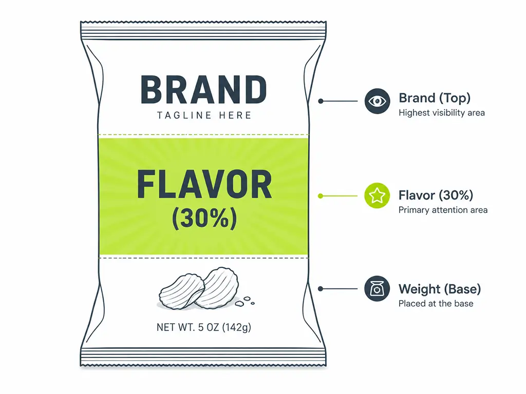
Regardless of the image strategy, the flavor hierarchy on the front panel must be ruthlessly clear. The flavor name should occupy roughly 30% of the front panel’s visual weight — achieved through a dedicated color block, an oversized type treatment, or a flavor icon system. The visual architecture reads top to bottom: brand logo first, flavor name second, key differentiator (e.g., “Kettle Cooked,” “40% Less Fat”) third, and net weight last. Let nothing crowd the top half of the bag with secondary information.
The back panel is where consumers go after they’ve decided to pick up the bag — so it carries the detail work: ingredients, nutrition facts, barcode, and brand story. Under U.S. FDA regulations (21 CFR 101.9), the nutrition facts panel follows a mandatory format — this is not a design choice, it’s a legal requirement. Net weight declaration must appear in the bottom 30% of the front panel, parallel to the base (21 CFR 101.7).
Sustainability as a Design Element — Not Just an Afterthought
For brands entering North American and European markets, sustainable packaging is no longer a differentiator — retailers and consumers both expect it. The question has shifted from “should we go green?” to “how do we make green look good?” The answer: eco-friendly materials need to be a visible part of the visual identity, not a footnote on the back panel.
Material choice is itself a design statement. Kraft paper exteriors telegraph natural, rustic, and handmade — a visual shorthand for authenticity that consumers trust. Matte white films read as clean, minimal, and premium. These substrate choices influence the consumer’s perception before any ink is laid down.
Certification marks — BPI compostable (ASTM D6400), OK Compost (EN 13432), FSC for paper sourcing, How2Recycle labels — should be integrated into the design architecture rather than hidden on the back. The most effective approach treats them as a border element, a bottom-bar badge strip, or a small icon row on the front panel.
But honest communication about material trade-offs is essential. Recyclable mono-material PE films typically deliver 30–50% lower oxygen barrier performance than conventional metallized laminates. PLA compostable films soften at around 40°C — hot enough that a shipping container in summer transit could deform the package. Brands that gloss over these realities and use vague terms like “eco-friendly” face increasing regulatory scrutiny under tightening greenwashing rules in both the EU and U.S. The winning approach: be specific, be verifiable, and design the truth beautifully.
The broader aesthetic trend for 2026 supports this direction. Pantone’s Color of the Year, Cloud Dancer — a refined off-white — anchors a movement toward “quiet luxury” in packaging: calm neutral bases paired with confident, expressive typography. For chip brands, this means a bag can feel premium without shouting.
Printing Technologies Compared — Digital, Flexo, and Gravure for Chip Bags
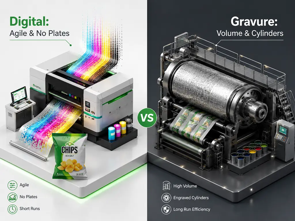
Choosing a printing method isn’t about which technology is “best” — it’s about which one aligns with your order volume, design complexity, timeline, and budget. Think of it this way: digital printing is like a high-end laser printer (zero setup, print on demand), flexography is like a newspaper press (fast once running, setup costs upfront), and rotogravure is like a currency printer (extreme precision, extreme cost, only justified at massive scale). Each has a sweet spot.
| Dimension | Digital (HP Indigo) | Flexographic | Rotogravure |
|---|---|---|---|
| MOQ | 500–5,000 pcs | 10,000–50,000+ pcs | 50,000–100,000+ pcs |
| Setup Cost | Near zero (no plates or cylinders) | Medium ($200–500 per color set) | High ($500–1,500+ per cylinder) |
| Per-Unit Cost at Scale | Higher | Medium | Lowest |
| Typical Turnaround | 7–10 business days | 15–20 business days | 20–25+ business days |
| Color Range | Up to 7 colors, ~97% Pantone coverage | 6–8 colors standard | 8–10 colors, excellent consistency |
| Design Changes Between Runs | Free (no tooling to replace) | Costly (new plates needed) | Very costly (new cylinders needed) |
| Best For | Startups, multi-SKU, seasonal LTOs, market testing | Established brands, mid-volume, stable designs | Mega-brands, ultra-high volume, long-running SKUs |
Digital Printing — The Agile Choice for Modern Chip Brands
Digital printing has been the single biggest shift in chip bag manufacturing over the past decade. It changed three fundamental rules: setup cost goes to near zero, color count stops being a constraint, and production runs can be as short as a few hundred units without economic penalty.
For chip brands, this matters in very concrete ways. A startup launching with three flavors no longer needs to buy three sets of printing plates before producing a single bag. A brand managing 30 SKUs can print all of them in a single production cycle without tooling changes — each design file is just a digital file. Seasonal limited-edition flavors, which used to be uneconomical for small brands due to plate costs, become viable with digital’s zero-changeover economics.
The quality bar has risen alongside accessibility. HP Indigo 20000 and 25000 presses — the workhorses of digital flexible packaging — deliver 812 dpi output across up to 7 colors, covering approximately 97% of the Pantone gamut. For most snack brands, the visual result is indistinguishable from conventional printing. The trade-off is speed: digital runs at 32–42 meters per minute depending on color count, compared to flexo at 150–300 m/min. This means digital’s per-unit cost is higher at very large volumes — the crossover point where flexo or gravure becomes more economical typically falls between 5,000 and 10,000 units, depending on design complexity.
The broader market reflects this shift: the global digital printing for flexible packaging market reached $5.97 billion in 2025, growing at 11.8% annually, with pouches representing 37% of the segment (Mordor Intelligence, 2025). For snack startups and brands managing multiple SKUs, finding a manufacturer that runs true digital production — HP Indigo presses built for flexible packaging, not office printers — can mean the difference between launching in weeks versus months. Manufacturers like Baishen Pack operate HP Indigo 20000 and 25000 presses dedicated to flexible packaging, with minimum order quantities as low as 500 pieces and 7–10 day turnaround. This production model — no plate fees, unlimited colors, split-run capability across SKUs — is purpose-built for how modern chip brands actually grow: testing, iterating, and scaling one flavor at a time (digital printing for flexible packaging).
Flexographic Printing — The Workhorse for Mid-to-Large Volume
Flexography remains the backbone of flexible packaging, producing an estimated 60% of all chip bags globally. It’s the right answer when your brand has proven product-market fit, your SKU designs are stable, and your order volumes justify the upfront investment in printing plates.
The economics are straightforward: each color in your design requires a photopolymer plate (Shore A 50–65 hardness), costing $50–150 per plate. A six-color design means $300–900 in plates before printing begins. But once the press is running at 150–300 meters per minute, the per-unit cost drops dramatically — making flexo the most cost-efficient option for runs of 10,000 to 50,000+ units.
Flexo’s other strength is its ink versatility. Solvent-based, water-based, and UV-curable ink systems are all mature on flexo presses, giving you broad compatibility with different film substrates. The technology is proven, the supply chain is deep, and quality is predictable.
The limitations are real, though. Design changes mean new plates — figure one to two weeks and another round of plate costs. Color count is typically capped at six to eight stations. Fine gradients and photorealistic images lose some fidelity because flexo’s minimum printable dot is 1–2% and maximum is 95–98% — very subtle highlights and shadows can drop out or fill in. Registration accuracy of ±0.1 mm is fine for text and graphics but falls short of gravure for photo-quality reproduction.
A practical strategy many successful brands adopt: run your core, high-volume SKUs on flexo for cost efficiency, and use digital printing for seasonal LTOs, new flavor launches, and market tests. You get the cost structure of flexo where it matters and the agility of digital where you need it.
- Most cost-efficient at 10,000–50,000+ units
- Stable designs with proven sales history
- 15–20 business day turnaround
- Zero tooling cost — no plates, no cylinders
- Unlimited colors per design at no extra cost
- 7–10 business day turnaround
Rotogravure — The Premium Choice for Mega-Volume Brands
Rotogravure sits at the top of the quality pyramid — and the top of the cost pyramid. If you need to ask whether gravure is right for you, the answer is almost certainly no. Gravure is for brands that have already answered that question through years of stable, high-volume production.
The technology is fundamentally different from the other two. Instead of flexible plates (flexo) or digital imaging (digital), gravure etches the image directly into a metal cylinder — steel core, copper plating for the engraving, chrome plating for wear resistance. A single cylinder can weigh 50–200 kg and costs $500–1,500+ per color. These cylinders can print millions of impressions with near-perfect color consistency — the first bag and the millionth bag will be indistinguishable.
The image quality is unmatched because gravure’s physical engraving depth — 40–50 microns for solid color areas, 3–5 microns for highlight dots — creates a tonal richness and depth that other methods approximate but never fully replicate.
The downsides are proportional to the capability. Cylinder production takes two to four weeks. Design changes require new cylinders. Solvent-based inks (typically ethyl acetate or n-propyl acetate systems) require VOC recovery infrastructure for environmental compliance. Cylinder storage alone becomes a logistics consideration for brands with many SKUs.
Gravure makes sense when you are printing 500,000+ units of the same design annually, your SKU lineup is stable, and you need absolute color consistency across production runs that span years. For everyone else — and that’s nearly every brand reading this — digital or flexo is the pragmatic choice.
From Design File to Production — The Pre-Press Workflow
You have nailed the design. Now comes the part most first-time packaging buyers get wrong — and the mistakes are expensive. Turning a Canva or Illustrator file into something a printing press can use is not a simple handoff. Miss a color mode conversion and your electric-green brand color prints olive. Skip the bleed and every bag ships with a white hairline along the edge. Forget to outline your fonts and the entire bag prints in Arial. Here is the workflow that prevents these disasters.
Step 1: Prepare Production-Ready Artwork
Your design file needs to meet printer specifications, not look good on your laptop screen. Start with the format: vector source files — .ai, .eps, or press-ready .pdf — not .png or .jpg. Any raster elements within the design must be at least 300 DPI at final print size.
Color mode is the most common pitfall. Your screen displays RGB, but presses print CMYK — and the CMYK gamut is 30–40% narrower than RGB. Vibrant greens, oranges, and purples are particularly prone to shifting dull when converted. If your brand uses specific Pantone spot colors, annotate the Pantone numbers in your file and check them against a Pantone Color Bridge swatch to preview the CMYK equivalent before you send the file.
Add 3–5 mm of bleed on all edges — this is the trim tolerance. Without it, a slight misalignment during cutting leaves a white sliver along the edge of your finished bag. And convert all text to outlines before sending. If the printer does not have your exact font installed, live text will silently fall back to a system default, and you will not know until you open the box of finished bags.
Step 2: Understand the Dieline
The dieline is the flat, unfolded template of your bag — showing exactly where the folds, seals, and cut lines fall. Every chip bag format has a different dieline, and working on the right one is the difference between a design that works and one that gets sliced in half by the fin seal.
Within the dieline, three zones matter. The safe zone — everything 5 mm or more inward from the cut and fold lines — is where your key content must live. Anything in the seal zone will be covered by the heat seal and is essentially invisible on the finished bag. The eye-tracking zone — the center 60% of the front panel — is where consumer attention naturally lands, and where your brand name, flavor, and hero image should concentrate.
Never guess at the dieline. Ask your manufacturer for the template file, place your artwork on it, and verify that all critical elements sit inside the safe zone before submitting.
Step 3: Digital Proofing — Your Last Line of Defense
A digital proof is a single physical sample printed on the same press that will run your full order. It is not optional. Screen colors lie — every monitor renders color differently, and no amount of staring at a PDF will tell you what the ink actually looks like on film.
When you receive a proof, inspect it under standard lighting (D50, 5000K — the printing industry’s color evaluation standard, not your office LED). Check color accuracy against your brand swatches. Verify that small text is readable and has not filled in or broken up. Confirm multi-color registration — look for white hairlines or color fringing at the edges where colors meet. Scan the barcode to make sure it reads.
One principle to live by: never approve a design for production based on what you see on screen. The proof is the only truth.
Step 4: Sign Off and Production Timeline
Once the proof is approved, production begins. Digital print orders typically ship in 7–10 business days. Flexo and gravure take longer due to plate and cylinder manufacturing — plan for 15–25 days depending on complexity.
When the first shipment arrives, set aside two or three finished bags as reference samples. These become your “standard color reference” for all future reorders — the physical benchmark against which every subsequent production run is measured. Color drift across batches is the silent killer of brand consistency, and the only defense is a physical standard that both you and your manufacturer agree on.
Your Chip Bag Design, Factory-Ready
Custom flexible packaging with digital printing — 7–10 day turnaround, MOQ from 500 pieces, no plate fees.
Request a QuoteReferences
- Mordor Intelligence. “Digital Printing For Flexible Packaging Market Size, Share & Growth Trends Report.” 2025. https://www.mordorintelligence.com/industry-reports/digital-printing-for-flexible-packaging-market
- HP Inc. “HP Indigo 20000 Digital Press — Specifications.” https://support.hp.com/us-en/product/product-specs/hp-indigo-20000-digital-press/5251499
- U.S. Food and Drug Administration. “21 CFR 101.9 — Nutrition Labeling of Food.” https://www.ecfr.gov/current/title-21/chapter-I/subchapter-B/part-101/subpart-A/section-101.9
- U.S. Food and Drug Administration. “21 CFR 101.7 — Declaration of Net Quantity of Contents.” https://www.ecfr.gov/current/title-21/chapter-I/subchapter-B/part-101/subpart-A/section-101.7
- Baishen Pack. “Digital Printing for Flexible Packaging.” https://www.bsflexpack.com/capabilities/why-digital-printing/
- Baishen Pack. Homepage. https://www.bsflexpack.com/